Trackly
Trackly
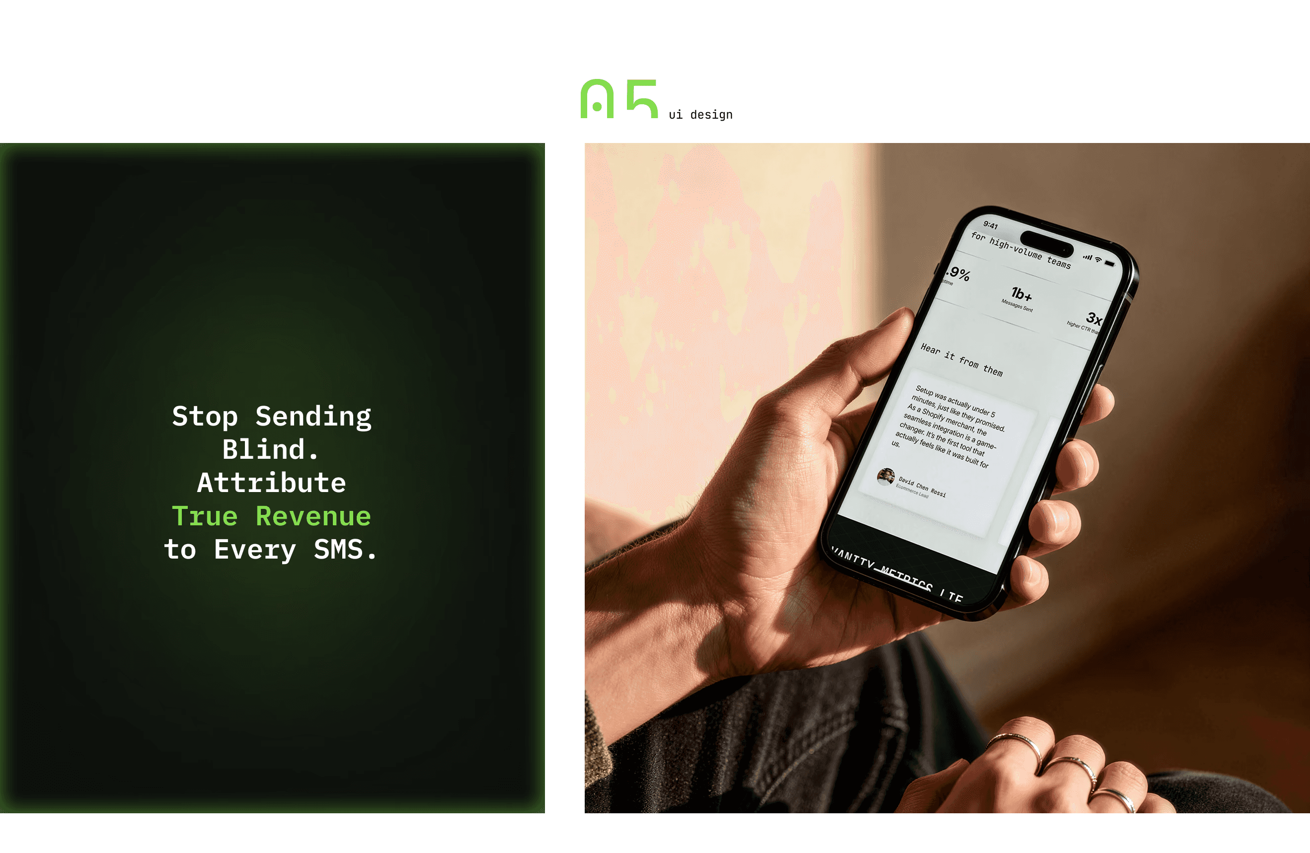
The project involved developing a comprehensive brand and design strategy, bridging the gap between technical power and a human-centric experience. Key focus areas included creating a professional "Pro" dark-themed environment balanced with light, airy sections to ensure maximum data readability for complex attribution metrics. We implemented a functional UI with a custom UI Kit, clean typography, and modern isometric illustrations to visualize complex distribution flows.
branding
ui/ux design
illustrations
saas design


Typography serves a critical functional role: JetBrains Mono headlines signal technical precision and algorithmic power, while the Inter typeface provides "invisible" legibility for complex analytics. This meticulous hierarchy extends to the custom wordmark, where the uniquely angled letter "l" serves as a metaphor for attribution—tracing every dollar back to its original campaign source
Typography serves a critical functional role: JetBrains Mono headlines signal technical precision and algorithmic power, while the Inter typeface provides "invisible" legibility for complex analytics. This meticulous hierarchy extends to the custom wordmark, where the uniquely angled letter "l" serves as a metaphor for attribution—tracing every dollar back to its original campaign source


The visual identity for Trackly SMS is centered on replacing marketing guesswork with precise engineering. At its core is the "Profit Cube," an isometric symbol representing robust, enterprise-grade infrastructure and "Total Visibility" in an industry often filled with "black boxes"
The visual identity for Trackly SMS is centered on replacing marketing guesswork with precise engineering. At its core is the "Profit Cube," an isometric symbol representing robust, enterprise-grade infrastructure and "Total Visibility" in an industry often filled with "black boxes"

The high-contrast "Pro" interface utilizes deep Midnight and Charcoal tones to establish a premium environment, while the high-voltage "Profit Green" acts as a strategic visual guide toward ROI and positive growth metrics
The high-contrast "Pro" interface utilizes deep Midnight and Charcoal tones to establish a premium environment, while the high-voltage "Profit Green" acts as a strategic visual guide toward ROI and positive growth metrics


Guided by the principle of "Minimalism with Purpose," the design eliminates visual noise to prioritize data readability and conversion speed
Guided by the principle of "Minimalism with Purpose," the design eliminates visual noise to prioritize data readability and conversion speed


Next project

Vernlab is a design agency
Based in Ukraine ➔ Working worldwide
Inspired by creativity, kept alive by coffee.
2025 vernlab